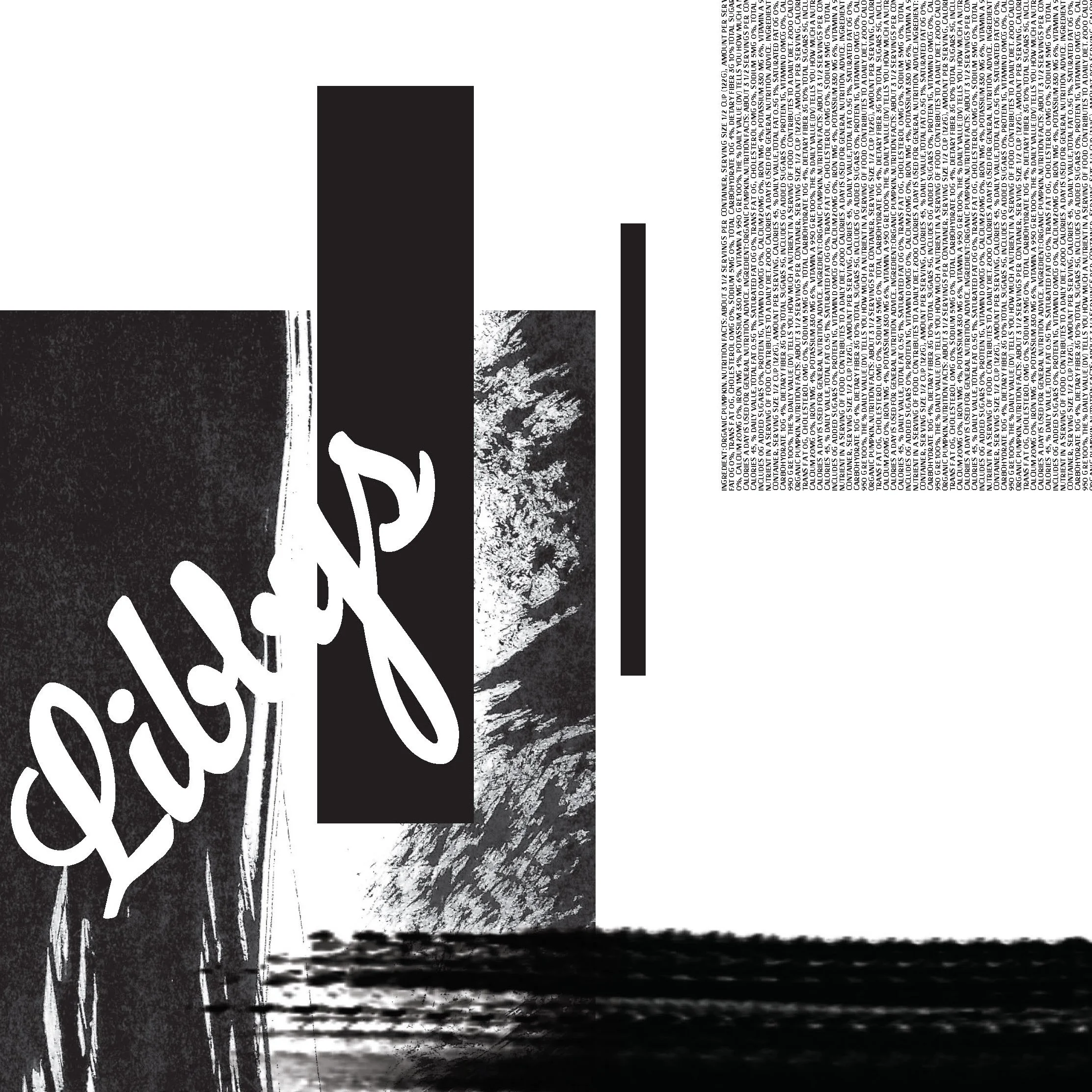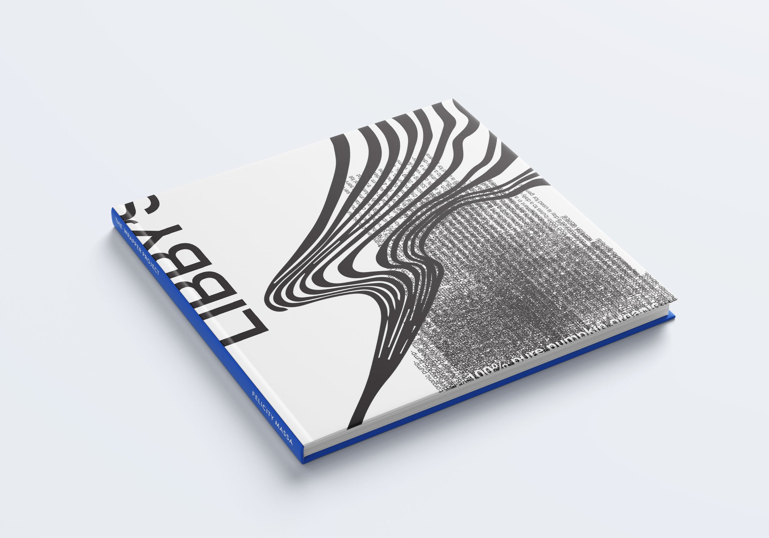
The Wrapper Project is a study of typography and hierarchy.
Digital Design | Print
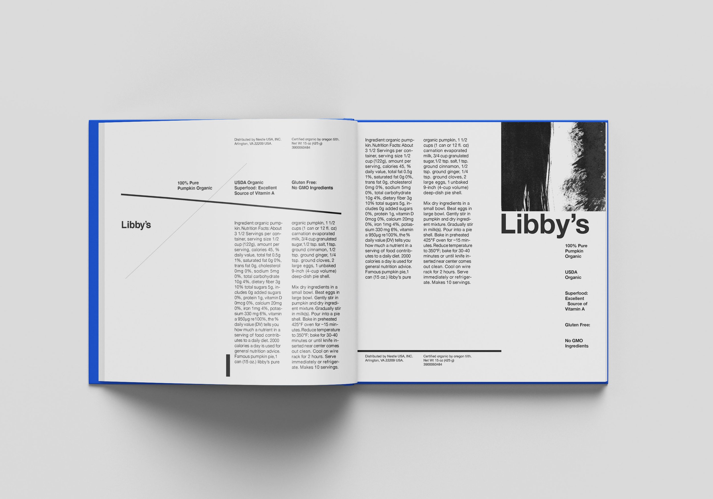
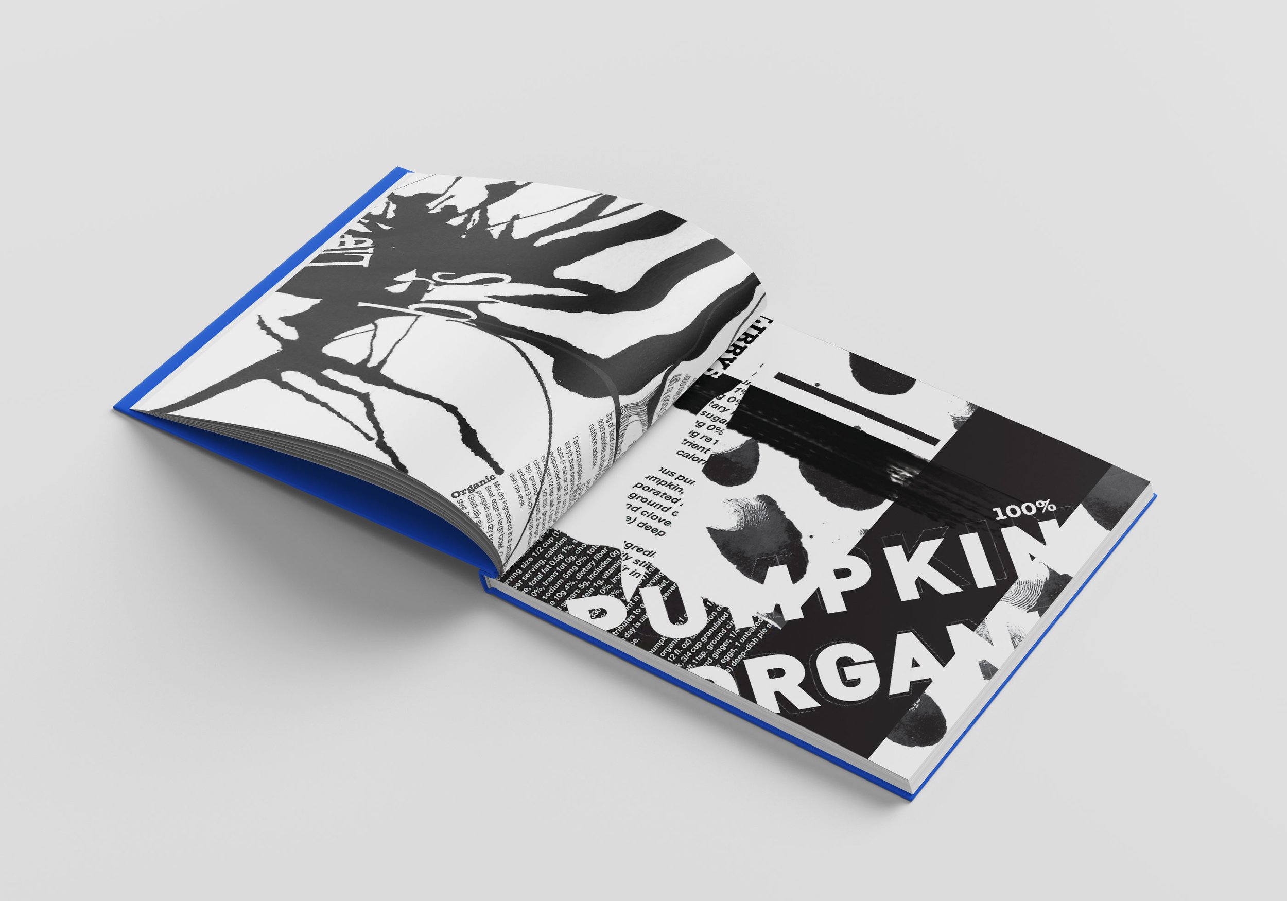
For this class project, we chose a canned food wrapper to analyze and deconstruct. We started with the basics, by extracting the information on the wrapper and organizing it in terms of the hierarchy of information. We used a quadrant grid to create a dynamic layout and organize the information. As the project went on, we were given fewer and fewer rules, and at the end we were encouraged to play with type, size, and visual aspects to create something completely new.
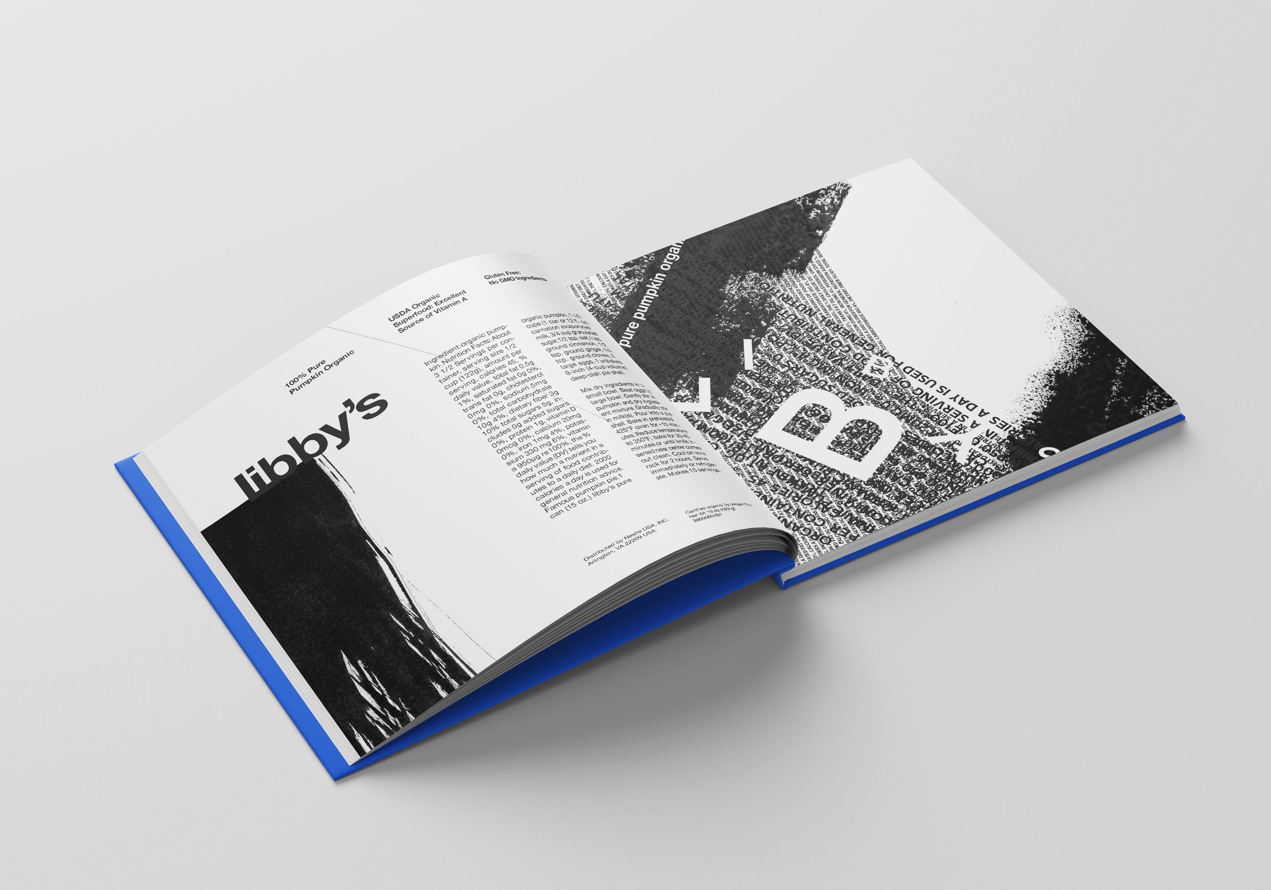
My label was “Libby’s Pumpkin Organic”. We started with a very basic layout, and by the end I had printed out several versions of my layout, ripped them up, and photocopied them back into the digital world, sometimes while I also moved the paper, to create something extremely unique that would be inimitable. The last step was to use collage and popular culture to express the label. Once finished, all the best versions were compiled into a book.
From left to right, you can see the devolution of readability. The main idea was to explore different techniques and tools to create something interesting.
For this part, I inserted the Libby’s Pumpkin Organic into Georges Seurat’s “A Sunday Afternoon on the Island of La Grande Jatte" (1884-1886), and for the second, I created a collage from a Thanksgiving magazine to emulate the feeling that Libby’s Pumpkin Organic gives - reminders of roasted turkey, family, the impending winter, and warmth.

